Design for Different Applications
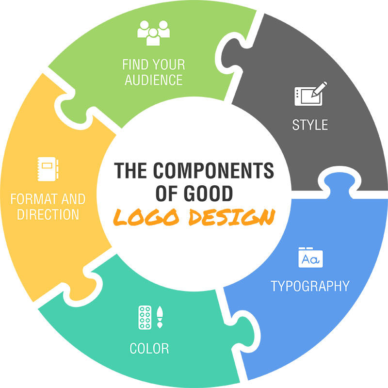
While you’re considering the above, it’s also essential to think about how your logo will end up being used. Are you a software company developing an app, or a small, local HVAC company? The software company should design primarily for digital use, while the HVAC company might want their logo embroidered on hats and shirts, or use it on a large outdoor sign.
The Psychology of Color
Logo design is a mixture of art and science, so let’s talk a little bit about how the colors you choose can alter the public perception of your brand. Think about the type of business you’re in, and go back to your target audience.
With that in mind, how would you like to distinguish yourself in the marketplace? Is your brand conservative? If so , the colors should reflect that. Look for deep, dark colors that reflect strength, trustworthiness. If you’re targeting kids, your color choices will be light, bright, and embody fun. Think about the feeling you want to portray and use colors to help distinguish you from the competition. Skimming Google for examples can be very helpful at these early stages. Even if the logos you’re finding have nothing to do with your industry, think about how they make you feel.
Style is Substance
If you’ve ever been through the design process, have you found it’s sometimes hard to explain why you don’t like something? Most likely, it’s because the style isn’t to your preference. So how do we develop the right style?
It all comes down to identifying how you want your logo to feel, then communicating that effectively to a designer. Again, this is one place where finding some examples online, not of competitors, but of logos that have that vibe or feel you’re looking for, can really pay off. Even things that aren’t logos can be useful and instructive for a designer.
It doesn’t stop there. Once you get some concepts, carefully consider them and provide open and honest feedback. If you don’t like one, try to determine why you feel that way. Are there parts you would keep? Would it be better in a different format? Using different colors? It might seem like a big headache, but it’s the best way to ensure that you end up with a logo you really love.
Don’t Ignore Typography
Let us say that again: don’t ignore typography! Unfortunately, typography is often an afterthought. Do not make this mistake. The font and typographical treatment is just as important as every other component of your logo, so make sure you give it its due. In fact the most noticeable thing about many logos created on design contest platforms is poor typographical design.
Great type treatments can take a logo from drab to incredible, and it’s also where great designers can really shine. Your designer should be taking all your feedback into consideration when designing the font style for your logo, but as always, it’s your job to let them know what’s working for you and what isn’t.
Relax!
Finally, just chill out a little bit. The process of creating a logo is fraught with assumptions and inflated expectations. Understand that a logo is not an ad; people aren’t going to tell everything about your brand by looking at it. Think of it instead as a signature, just a little something with some flair that tells a person who you are. Don’t try putting the entire weight of your brand on just the logo. It won’t work, and you’ll end up unhappy with everything your designer sends you.
Neither your brand nor your logo will exist in a vacuum; each one contributes to the other until (hopefully, someday) people see your logo and associate it with the brand personality you have established through all your other marketing efforts. People don’t pay through the nose for Nikes because they like the look of a checkmark, it’s all about the context of what that symbol has come to mean.
It’s important to remember this during (and after) the design process. While your logo is important, it’s not everything. Ultimately, how you engage with your target audience is what’s going to make the real difference.
So remember: be scientific so your designer can be artistic. All the different pieces of the puzzle of your logo need to fit together to best represent your brand, but that doesn’t mean it has to be all-encompassing or even perfect. But as in a puzzle, sometimes all it takes is moving one piece, and then all the others fall into place.


